XER Schedule Toolkit Global Design System
Description
Project planners and schedulers using Oracle Primavera P6 often face challenges such as the rigidity and complexity of .xer files, limited cross-functional tools for schedule comparison or integration, poor visibility and collaboration on schedule data, and difficulty extracting metadata or performing quality checks without deep P6 access—prompting stakeholders to seek a solution that enables .xer file parsing outside of Primavera, seamless conversion to shareable formats, automated schedule quality control, and improved collaboration between planning and delivery teams.
Year:
2024
Role:
Product Design
Industry:
Engineering, Construction, and Project Management

Building a comprehensive design system from the ground up in effort to unify XERscheduletoolkit's product and brand teams, fostering a shared design language across the entire business unit. The initiative aimed to enhance our ability to deliver superior and consistent design solutions efficiently.
A fresh start
A design system is a collection of reusable components, guidelines, and assets used to create consistent, cohesive, and user-friendly designs across different products or platforms. It serves as a single source of truth for design decisions and establishes a shared language and visual identity for a brand or organisation.
In 2024, XERScheduleToolkit lacked a formalised design system. This led to individual teams creating their own standards for UI elements, components, and modules, resulting in inefficiencies and inconsistencies across products and platforms. To address this, a design team consisting of one UI designers, one UX designer, one product managers, two copywriters, and myself as the Principal product designer was formed to oversee the design system.
Stakeholder involvement was crucial for the project's success. This was achieved through department-wide presentations to share pain points and anticipated benefits, as well as early engagement with the engineering team to get their input and update them on the project roadmap. The engineering team felt like equal contributors, valuing their early involvement. Together we would create a robust design system was key for improved consistency across all new XERScheduleToolkit products.

My Role
This project was the largest design project I worked on at Spencer British Engineering, and was the first opportunity to apply my knowledge of design systems across an entire business unit in the company.
I was tasked with creating and defining the visual language for all touch points across the product, which would heavily utilise elements from the new design system. My daily tasks included creating and maintaining the master Figma file, authoring embedded UI documentation, providing work streams with design reviews and support, and educating the organisation on design best practices and process. Throughout the time of this project I was responsible for enforcing visual consistency and quality across the platform.


Reaching for the highest standards
We support multiple web applications at XERScheduleToolkit. This includes a Project planners and schedulers portal where they can read.xer file, Schedule Health Checker, Detect changes between two schedules (baseline vs update), Converts schedule data for use in Power BI, Tableau, or ERP systems, carry out export/import sharing to support non-Primavera users among other activities. We also support data synthesis and visualisation tools for our research users, which enable them to sift through and quantify large amount of data. Our design system needed to support each of these applications and their individual users and use cases. And while it was clear that this project would require a lot of resources, planning, and time commitments, we knew that this work was a justified long-term investment in our company, brand standards, and our customers. Without a solid design system there would always be a disconnected user experience.
Streamlining our resources
Before building our new design system, we conducted a thorough review of our existing design components. This involved creating a UI inventory of our main interface elements and performing a comprehensive audit to identify all components used across our sites and products. We then captured unique instances of key design assets, such as typography, buttons, icons, and input forms, and compiled them into a Figma file for team review. This process revealed significant inconsistencies in our design assets, highlighting the necessity for a more systematic approach to documenting, communicating, and maintaining our design system.
What we found
The inventory process helped us clearly see all discrepancies and inconsistencies across our sites and products. It served as a foundation for kicking off our design system work. Keeping the audit results in mind, we created a priority list for our design system minimal viable product (MVP), and started assigning designers that would lead the exploration and documentation of each component.

Foundation Level
The success of a design system relies on its fundamental foundations, which encompass every component, template, and prototype its built on. After determining a visual direction that aligned with the XERToolkit brand, foundational elements were documented in Sketch and Figma and published to a Figma project. These resources were then shared with all teams for open discussion and visibility around the design decisions being made.The design system, named Juno, was designed to scale for each product and encompass every potential UI element across all products. The focus initially was on the foundational elements (atoms) of the design system, such as colour palettes, fonts, grid, spacing, and buttons, before progressing to more complex blocks and pieces (molecules, organisms, templates, pages).
Atomic Design framework
There are many methods for organising and structuring the vast components of a design system but chemistry is the inspiration behind the Atomic Design Methodology. The idea is inspired by the concept of chemistry, where all matter is composed of atoms that bond to form molecules, which then combine to create more complex organisms. Similarly, interfaces are built from smaller components, allowing for the breakdown of entire interfaces into fundamental building blocks. This methodology aligns well with design systems, as it enables the documentation, styling, and reuse at each level of the atomic hierarchy, saving time and improving consistency across design and development teams.
Building the system ( Foundations of the System)
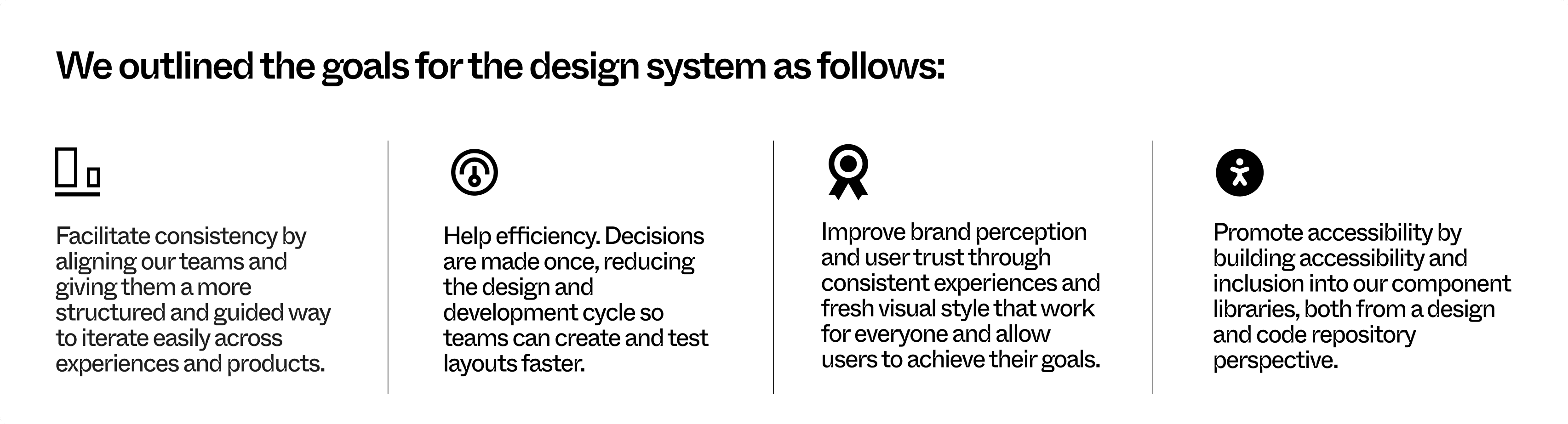
When we began building our design system, we set the following rules for ourselves:

Grids and Spacing
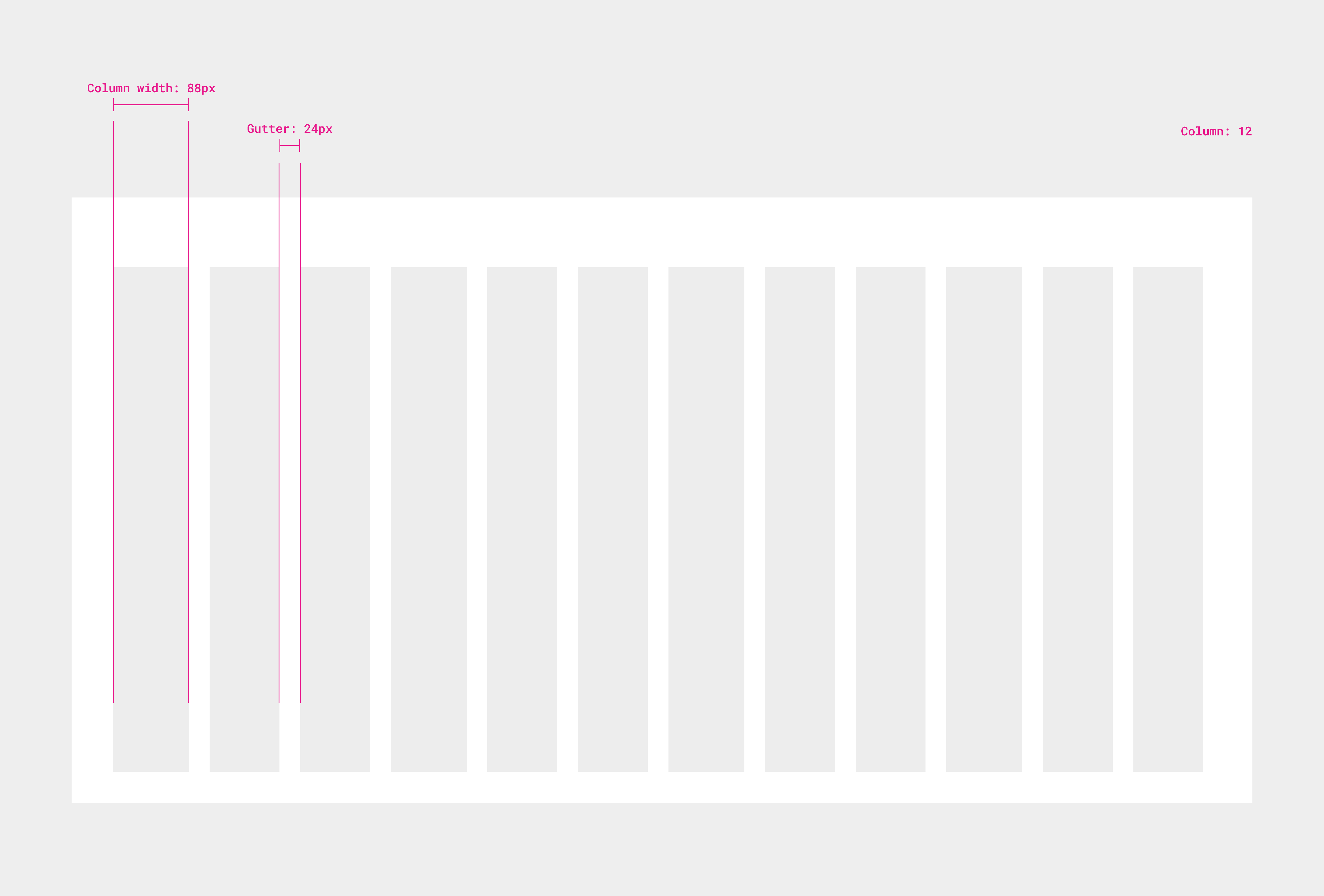
The grid is the foundation for positioning elements onscreen. Consisting of columns, gutters, and margins, the grid creates a seamless, easy-to-follow structure for the layout of elements on a page. Consistent use of a grid system provides the foundation for harmoniously and consistently positioning text, images, and spacing elements onscreen.We chose an 8 point grid system. Our base grid is 8 x 8 pixels, meaning that all elements are sized and spaced at even multiples of 8 (16, 24, 32, 48, 128, etc...) This makes our component system robust, responsive, and easy to use because all of the top screen sizes are divisible by 8 on at least one axis. This is important to help prevent anti-aliasing.
Desktop
Color palette
We wanted to use colours purposefully to communicate how things function in the interface at XERToolkit. This helps us create visual patterns that can make interacting with our product easier and more predictable for users. Our color system uses a semantic naming structure, which means the names tell us about the purpose or use case of the colors rather than their hue. They are organized into 4 categories: Primary, Secondary, Neutral, and System. All color tokens are added as a color style so that they may be easily accessed.

Typography
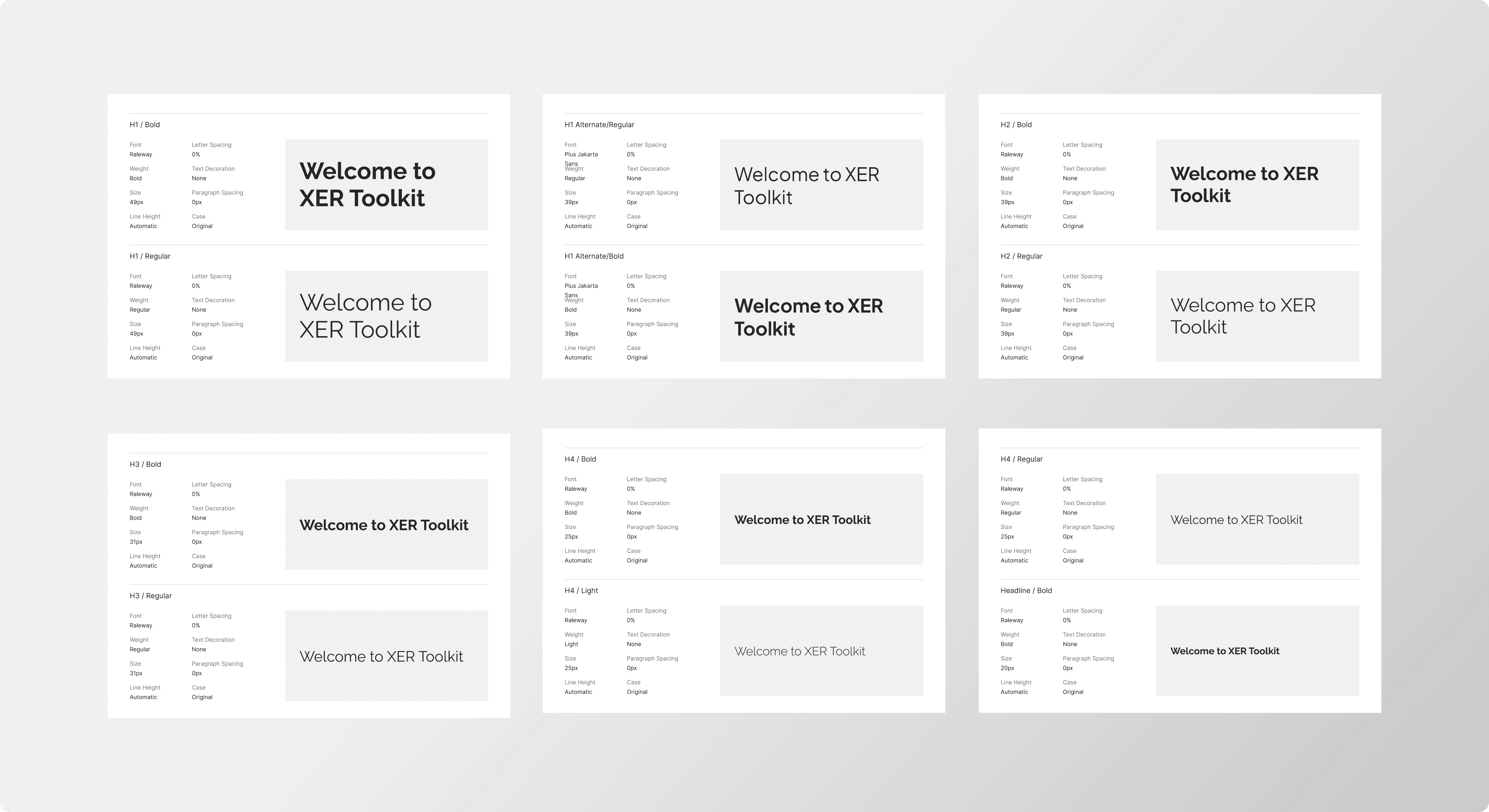
As a project management solution, we prioritised accessible communication over aesthetics, ensuring that text is easily readable and helps users understand important information through a clear and well-contrasted size and colour hierarchy. We selected the Poppins typeface for its elegant and versatile sans-serif design, featuring geometric letter shapes and balanced spacing. This typeface offers several variations in weight, making it suitable for both headings and body text. All text sizes, styles, and layouts were carefully adjusted to ensure a seamless experience across various screen sizes, enhancing the overall user experience on the website.
Iconography
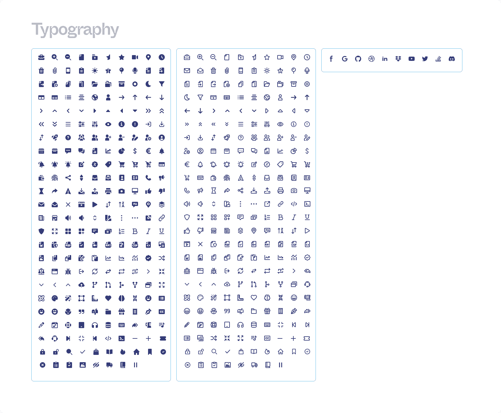
Our icons were designed to effectively communicate intent and enhance navigation. They symbolise various elements such as commands, files, delivery methods, devices, and services, and are also used for common actions like search, print, and edit. We prioritise simplicity and intelligibility, ensuring that each icon in our library is reduced to its minimal form to capture the essence of its meaning, thus guaranteeing readability and clarity even in small sizes. Many of our icons are based on the Feather Open Source icon library, featuring simple and modern outlines and available in multiple sizes (16, 24, 32, and 40 pixels), making them easily scalable for any user's needs.
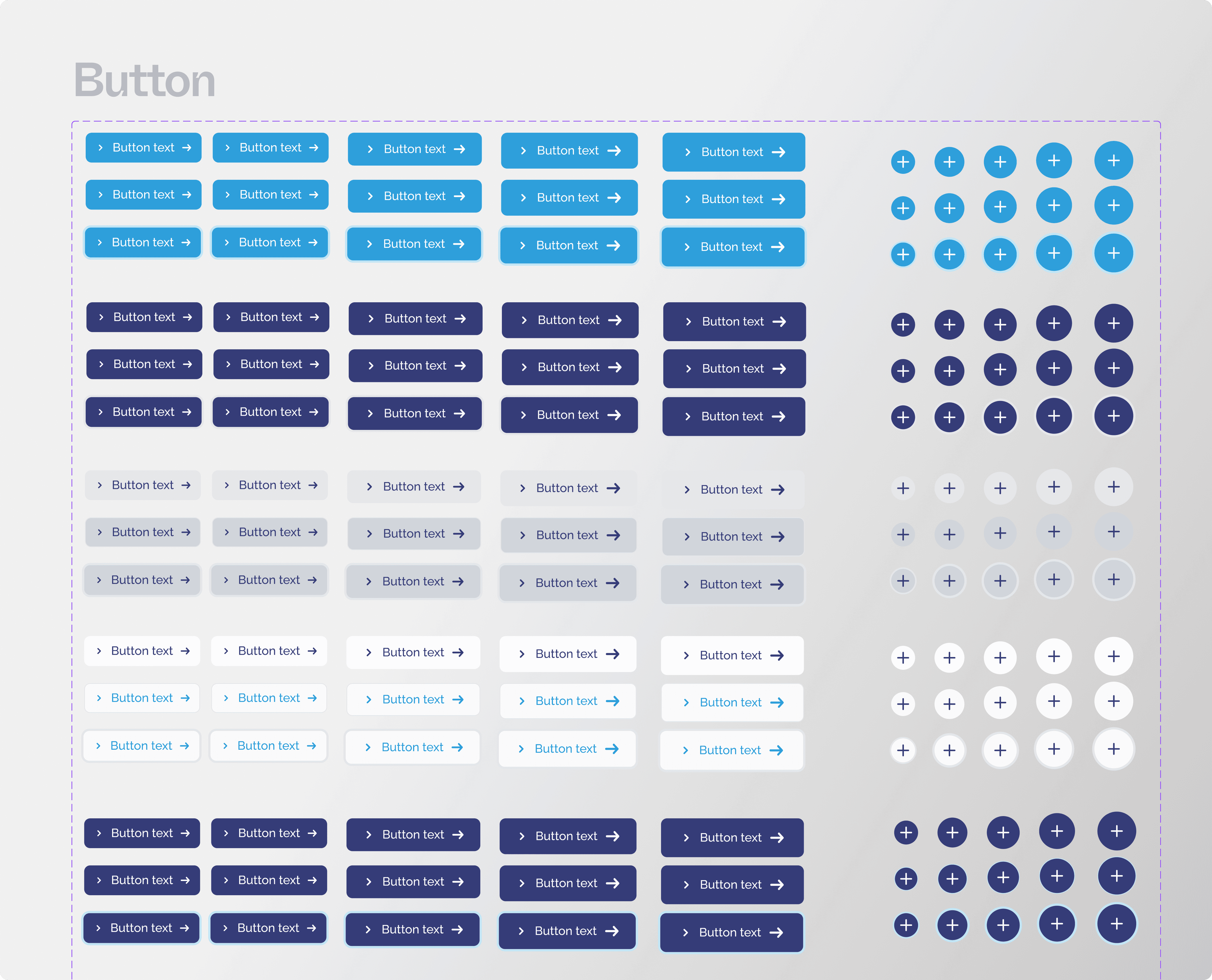
Other components
Design systems are complex and there many components that have been built. The following are various highlighted components that round a small part of the vast elements of our design system.

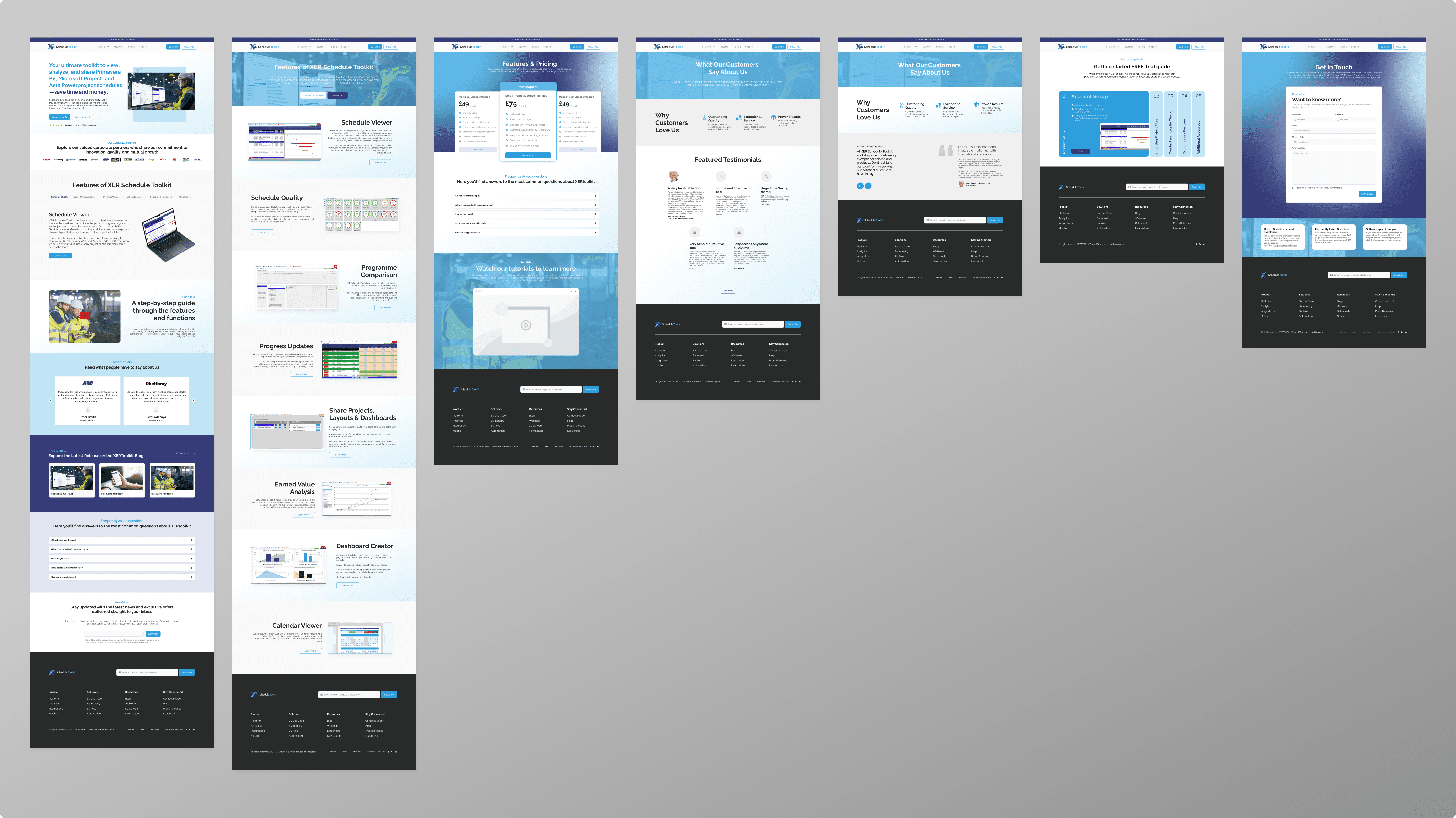
Bringing it together
Working with a blended teams across multiple departments created a need for easy to consume page templates. The ability to produce hi-fidelity prototypes spanning the entire GeneDx experience allowed designers to move at a fast pace that the project necessitated.
Because we work with many product and brand teams across multiple departments, we needed to create easy to consume, easy to adapt page templates.
Evaluating the work
Reviewing work was an important part of any design process to ensure we arrive at decisions collectively and align on details such as component design, documentation, and tools. For this project, we formed a multidisciplinary design system team that would meet every month to discuss the direction and progress of work. These practices allow us to collect everyone’s perspective and bridge the gap between design and engineering.
Outcome

Conclusion
The new design system enabled the design team to create consistent and unified features, while also helping the engineering team streamline their codebases. This led to a more efficient and user-friendly platform, surpassing management and engineering expectations and resulting in increased efficiency and overall performance improvement. User feedback was notably positive, particularly regarding the modernised user journey Journey experience, which aligned with contemporary web and social media app standards. While it's challenging to measure the impact of internal-facing projects like design systems, I'm confident that the investment in our design system not only improved the system itself but also resulted in better designs being implemented and a clearer understanding of XERScheduleToolkit design direction. When a design system effectively addresses daily challenges, it gains rapid acceptance and trust within the organisation, promoting familiarity, greater engagement, and product alignment.
What’s next?
The design system is an ongoing project. I iterate, change and learn a lot in the process. So far, I have a library of fundamental components in use. This has been game-changing for my team in terms of efficiency, consistency, and standardisation. Some of our team’s next steps include:
